
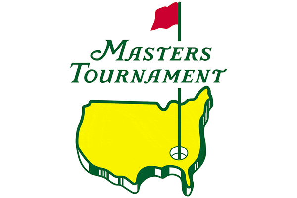
A Brief History of The Masters Logo
"A tradition unlike any other." Jim Nantz's singular catchphrase for the Masters Tournament has defined his 36 broadcasts at Augusta, and will endure long after the legendary announcer retires. The staying power of both the catchphrase and the tournament, along with its iconic Masters Logo, captures something intrinsic to each where repetition (tradition) becomes as important as, if not more than, the competition.
When Bobby Jones and Clifford Roberts founded Augusta National, they did so to create a unique, world leading golf course in the heart of Georgia (Jones's home state). And it would be very difficult to argue that they didn't accomplish that goal. Designed by Jones and Alister MacKenzie, and opened in 1932, the golf oasis wasn't initially as successful as it is today. In 1934, Clifford Roberts convinced Bobby Jones to come out of retirement and play in an invitation-only tournament on club grounds in order to create a buzz around the newly founded Augusta National. The rest, as they say, is history. And let’s take a look at that history and all the fun Masters trivia that comes with it, shall we?
The Origins of the Masters Logo

The field of the inaugural "Augusta National Invitation Tournament" was initially composed only of Jones's close friends and associates. It was on the program for this 1934 tournament (featured here, image courtesy of PBA Galleries) that we get our first glimpse at version one of the Masters logo: a map of the continental United States with a hole and pin flag marking the (approximate) location of the course.
There is very little information about the origins of the Augusta logo, but from the above program, one can begin to see why map enthusiasts have been quietly seething about it for the last 90ish years. If you, like me, have been blissfully ignorant about this raging cartographic battle and prefer to stay that way, then I must warn you; once you see it, you cannot unsee it. Writing on the mapping mystery that is the Masters Logo, Adam Peck created a perfect gif to show just how off kilter the Masters Logo really is.
As you can now see, the Masters logo drawn onto the 1934 program has a number of geographical errors. From the sort of lazily sloping southern border with Mexico to the elimination of the Great Lakes up north, perhaps this original version of the Masters logo was drawn by an artist who was only slightly familiar with the USA.
There is also the almost cartoonishly silly eastern seaboard with a prominent Maine (as it falsely appears to be more northern than it's western cousins) that is at the same time lumpy and misshapen, as well as the flaccid likeness of Florida dangling off the southern coast. This could be chalked up to an underpaid artist, or the haste with which the original Augusta Logo was created. But going back to what makes The Masters so special and unique – tradition – change comes slowly, if at all, to Augusta.
The Masters Logo Through the Years
An article in UniWatch did a deep dive through the evolution of the Augusta logo, covering its strange inconsistencies over a range of products and promotions. Looking through our own stock of authentic Masters merchandise, the outline of the United States has certainly changed from the days when Masters food prices offered $0.25 pimento cheese sandwiches.
As you can see from the evolution of Masters merchandise, the map of America has changed significantly, though not always in the direction of accuracy. The Masters logo now reflects a wavy northern border dipping and undulating around the Great Lakes region while ditching the curve of the northwestern border with Canada.
Some changes, such as the southwest, have become more ill defined. The Rio Grande's path has been replaced by a near-diagonal line from El Paso to Port Isabel. Florida has lost whatever rigidity it had, now dangling limply into the Gulf of Mexico.
How has the Flag Location Changed on the Masters Logo?
The flag seems to shift, even on 2021 dated merchandise, between being a completely straight north/south line, and an accurately windswept (as with the 1934) slight angle following the pin flag. The three dimensionality of the United States has remained, but has perhaps thickened slightly since its "pie crust" beginnings on the inaugural tournament program. On the modern Masters Logo, the US is more sod-like, and really sells the idea of Augusta National being the "hole-in-one" of America.
This appearance of depth has been accomplished in various ways over the years. From the vertical shading lines of the original Masters Logo through the gradual consolidation of the modern version’s set of (approximately) 8 green shading blocks, the 3D logo doesn't necessarily exist everywhere.


What Masters Logo is Used on the Green Jacket?
On the legendary Green Jacket, you can see that the Masters Logo patch appears to be 2D, and has, yet another, version of America. This flat USA features a well defined Michigan, and even includes a sharp divot for Seattle's Puget Sound. The brass buttons are likewise two-dimensional, but don't seem to quite mirror the patch's outline of America.
Interestingly, the location of the hole and flagstick is closer to the Grand Canyon than the loblolly pines of Georgia. We’d give the benefit of the doubt to the cross stitcher here, recognizing that an embroidered patch could require a degree of license to ensure all the prominent features of such an iconic logo can be reflected. In fact, those green jackets are all made by hand and require a month’s worth of work by Ohio-based Hamilton Tailoring.
What Colors are Used in the Masters Logo?
Augusta National is one of the few private golf clubs in America that is run as a for-profit organization, and as such, has become quite skilled at making money. They have tight controls over coverage of the Masters, they retain ownership of all Green Jackets, bought Jim Nantz's Masters tagline, own their (literally) trademark shades of yellow and green, and have the rights to "Amen Corner." Most of all, they refuse to allow any unauthorized reproduction of the Masters logo – full stop.
Companies like Titelist and TaylorMade might have green and yellow "season opener" hats and bags, but they won't be Augusta's green and yellow, and they won't say a word about the Masters. Like professional sports logos, the Masters Logo is an enormous revenue stream for Augusta National, and authentic merchandise isn’t easy to get. You can sign up for the Masters ticket lottery and visit the onsite store yourself, or check out the items in our Masters shop until your number might finally be called!
For the Masters, Image is Everything
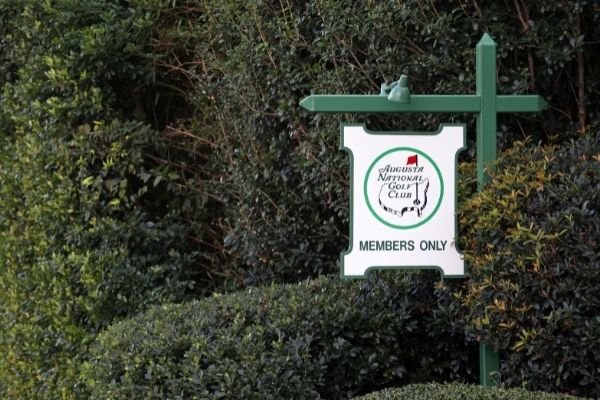
Augusta National, like its founders, members, and owners take their public image extremely seriously. Beyond the impact on their bottom line, the course and its image is steeped in pageantry and tradition. Membership numbers are capped, and one can only join by direct member invitation.
Masters champions cannot take their custom green jackets off the premises (except for the year in between their victory and the next Masters), and do not win membership to the club. They have strict rules of play and course etiquette for their members and guests, and if you're lucky enough to be granted an invitation to watch The Masters, you must follow course rules or risk being thrown out and banned.
On the hallowed grounds of Augusta, you play by their rules. Photo Credit: Katherine Welles - stock.adobe.com
Beyond maintaining an air of esteem, the club has a rich history of manipulating their image. They import pine straw from the Carolinas to line their flower beds and boundaries. They used to dye their water hazards and ponds blue in order to preserve the idea of the perfect golfer's oasis. And the bane of ornithology enthusiasts everywhere, play calming bird calls on inconspicuous speakers placed throughout the grounds, in hopes of creating the atmosphere of a sanctuary for both members and wildlife alike.
So perhaps it's fitting that the Masters Logo is a bit wonky and off kilter. A vision of the US that may or may not reflect an old man’s 1934 depiction – a not quite idealized America but one where the edges are softened, proportions shifted, and borders widened. It all works together to create something that never was, but which can somehow become immediately real if you ever get to take your trip down Magnolia Lane.
This post may contain affiliate links and we may earn a small commission if you use them to purchase products, at no additional cost to you. As an affiliate partner to premier platforms like Amazon and Top Shelf Golf, we help fund this blog with the earnings we make from qualifying purchases. Thank you for supporting the Great Golf Blog!